Should Window Frames Match Siding Color- A Comprehensive Guide
Understanding Color Coordination in Home Exteriors
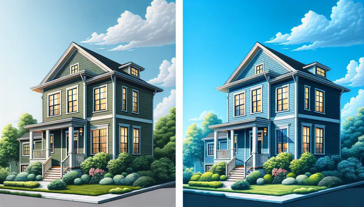
Color coordination is important when you want your home to look nice from the outside. It can help your home stand out or blend in, depending on what you want. A common question homeowners face is, “Should window frames match siding color?” The answer depends on your personal style and the overall look you want for your home.
Color coordination begins with understanding some basics about colors. Colors can be warm or cool, and they can look good together or create a contrast. Choosing the right colors can make your home look better and even increase its value. Deciding if your window frames should match or contrast with your siding can change how your home looks a lot.
Matching window frames with the siding color often makes everything look like it belongs together. This choice can make a home appear larger and more harmonious. For instance, if your siding is a soft gray, matching window frames can provide a seamless look that doesn’t distract from other parts of your house. However, this approach might lack visual interest and could make the home look a bit too uniform.
On the other hand, choosing to contrast window frames with the siding can add character and interest to your home. For example, if you decide to keep the window frames white against a darker siding, it can make the windows pop and give the home a fresh, clean look. Similarly, adding contrast by deciding to paint the garage door black can create a striking effect that draws attention and adds depth to your home’s exterior.
In conclusion, whether you choose to match or contrast your window frames with your siding, the key is to think about the overall color scheme of your home. Consider how different elements work together and how they reflect your personal style. By understanding these basics, you can make decisions that enhance your home’s exterior and make it uniquely yours.
Pros and Cons of Matching Window Frames to Siding
When deciding whether window frames should match the siding color, it’s important to weigh the pros and cons. This choice can change how your home looks, and knowing the benefits and drawbacks will help you make a decision that suits your style.
Pros of Matching Window Frames to Siding:
-
Everything Looks Together: Matching your window frames with the siding makes everything look like it belongs together. This can make your home look more unified and polished. For instance, if your house has a beige siding, using the same color for the window frames can create a smooth transition, which is pleasing to the eye.
-
Simple Look: A matching color scheme can make the overall design simple, making it easier to highlight other features, like landscaping or special parts of the house. This approach often appeals to those who prefer a neat or modern style.
-
Makes the Home Look Bigger: When window frames and siding are the same color, it can make your home look bigger. The continuous color flow creates an illusion of more space, which can be a great trick if you’re working with a smaller structure.
Cons of Matching Window Frames to Siding:
-
No Contrast: While everything looking together is nice, it might also lead to a lack of visual interest. Without contrasting colors, your home’s exterior might appear flat or dull. This is especially true in neighborhoods where many homes look similar.
-
Missed Chances for Character: Matching colors means missing out on the chance to add unique character to your home. By introducing contrast, like deciding to keep the window frames white against a darker siding, you can create standout features that give your home a distinct personality.
-
Harder Maintenance: Sometimes, matching colors can make future maintenance more challenging. Slight differences in paint batches or exposure to the sun can cause color differences over time, making it harder to keep everything looking the same.
Ultimately, the decision to match or contrast your window frames with your siding should align with your personal preferences and the overall look you wish to achieve. Consider these pros and cons carefully, and remember that adding your personal touch is what makes your home truly unique.
How to Create Contrast with Window Frames
If you’re looking to add a bit of flair to your home’s exterior, creating contrast between your window frames and siding might be the way to go. Contrasting colors can add depth and personality to your home, making it stand out in a sea of similar-looking houses. Here, we’ll explore some of the benefits of contrasting colors and how to choose shades that work well together.
Benefits of Contrasting Colors
Contrasting colors can highlight your home’s interesting features and draw attention to specific areas. For instance, if you choose to keep the window frames white against a darker siding, it can make the windows pop, offering a crisp and clean look. This approach not only adds visual interest but can also make your home seem more inviting.
Another way to add contrast is by selecting bold colors for other elements, such as your garage door. Opting to paint the garage door black against a lighter siding can create a striking focal point. This bold choice adds depth and can make your home appear more modern and stylish.
Choosing Contrasting Colors
When selecting contrasting colors, it’s important to consider how they look together. A good rule is to pair neutral tones with bolder colors to ensure balance. For example, if your siding is a warm beige, keeping the window frames a bright white or a deep black can provide a pleasing contrast without clashing.
You might also think about the overall color scheme of your neighborhood. While you want your home to stand out, you don’t want it to stick out like a sore thumb. By choosing colors that contrast but still look nice with nearby houses, you can achieve a unique look that’s both tasteful and eye-catching.
Examples and Inspiration
Consider using online tools or paint swatches to experiment with different color combinations. For instance, if your roof is brown, a touch lighter than the smoked timber colour, choosing window frames in a complementary or contrasting shade can tie the whole look together. This can create a cohesive yet dynamic appearance that reflects your personal style.
In conclusion, contrasting window frames with siding is an excellent way to infuse character and individuality into your home’s exterior. By carefully selecting colors that enhance each other, you can create a visually appealing and welcoming environment that truly feels like home.
Including Soffits, Eavestroughs, and Roofs
When planning your home’s exterior color scheme, it’s important not to overlook the role of soffits, eavestroughs, and roofs. These elements can significantly influence the overall look of your home and help tie your color choices together. Let’s explore how to incorporate these features into your design plan.
Soffits and Eavestroughs
Soffits and eavestroughs, often called gutters, help manage water flow and protect your home from the elements. But they can also serve as design elements. When deciding on colors for these components, consider how they interact with your siding and window frames. For example, you might choose to paint the soffit/eavestroughs either black or the smoked timber colour. This decision can create a striking contrast with lighter siding or blend with darker tones, adding depth and interest to your home’s facade.
Roofs Matter Too
Your roof is another big part of your home’s exterior that deserves attention. It occupies a large visual space, and its color can set the tone for other color decisions. If your roof is brown, a touch lighter than the smoked timber colour, this can serve as a neutral backdrop that allows other colors, like window frames or eavestroughs, to stand out. Choosing complementary or contrasting colors for your siding and trim can create a balanced and cohesive look.
Creating Harmony
To create a harmonious exterior, think of your home as a complete picture. Each part, from the roof down to the eavestroughs, should contribute to the overall look. For instance, if you opt to keep the window frames white, this can provide a clean contrast against a darker roof and siding. Similarly, deciding to paint the garage door black can tie in with darker eavestroughs, creating a unified appearance.
Practical Tips
When selecting colors, consider the material and texture of each element. Some materials, like metal or wood, may have limited color options or may require specific types of paint. Testing colors in different lighting conditions can also help ensure you achieve the desired effect. Remember, the goal is to find a balance that enhances your home’s beauty while reflecting your personal style.
By paying attention to these additional elements, you can create a well-coordinated exterior that not only looks great but also functions effectively to protect your home. This thoughtful approach will boost your home’s curb appeal and make a lasting impression.
Practical Tips for Choosing Exterior Colors
Choosing the right colors for your home’s exterior can feel overwhelming, but with a few practical tips, you can make the process easier and more enjoyable. Here’s a step-by-step guide to help you choose colors that will enhance your home’s appearance and reflect your personal style.
1. Start with Inspiration
Begin by gathering inspiration from homes you admire, whether in your neighborhood, online, or in magazines. Pay attention to color combinations that catch your eye, especially those that include elements similar to your own home, like a brown roof, a touch lighter than the smoked timber colour. This can help you visualize how different colors might look on your own house.
2. Consider the Environment
Take into account the natural surroundings and the style of your home. If you live in a wooded area, earthy tones might blend well, while a coastal setting might call for lighter, breezier colors. Also, think about how the colors will look throughout the year, considering seasonal changes.
3. Test Before You Commit
Before making a final decision, test your chosen colors. Purchase small samples and paint swatches on different areas of your home’s exterior. Observe how the colors look at different times of the day and under various lighting conditions. This will help you avoid surprises and ensure you love the final result.
4. Use Online Tools
Online design tools can be incredibly helpful. Many paint companies offer virtual design tools that allow you to experiment with different color combinations. You can even upload a photo of your home to see how various colors will look together. This can be particularly useful when deciding whether to keep the window frames white or paint the garage door black.
5. Think About Long-Term Maintenance
Consider the maintenance involved with your color choices. Lighter colors may show dirt more easily, while darker colors might fade faster. Choose high-quality, durable paint to ensure your home looks great for years to come. And remember, if you decide to paint the soffit/eavestroughs either black or the smoked timber colour, you’ll want to ensure the paint can withstand weather conditions.
6. Trust Your Instincts
Ultimately, your home’s exterior should reflect your personal taste. Trust your instincts and choose colors that make you happy. Whether you prefer a bold, contrasting look or a more subtle, cohesive palette, your choices should align with what you love and what makes your house feel like home.
By following these practical tips, you can confidently select exterior colors that enhance your home’s curb appeal and showcase your unique style. Remember, the key is to experiment, take your time, and enjoy the process of transforming your home into a beautiful and inviting space.
We’d love to hear from you! What colors are you thinking about for your home’s exterior? Share your ideas or ask questions in the comments section below. Join our community on HomeSolver to connect with others and find more inspiration for your home projects. Happy decorating!
Related
- How to Handle Inaccurate Room Size Information Before Moving In
- Creative Uses for Milled Rough Lumber in Home Design
- Essential Tips for Perfect Living Room Lighting Setup
- Maximizing Space and Comfort- The Ideal Modular Sofa as a Guest Bed
- Leather vs Fabric Sleeper Couch- Making the Right Choice for Your Home